Ionic and Apple’s UIWebView API Deprecation

In typical Apple fashion, they recently announced that they would no longer accept any mobile applications that utilise UIWebView, from April 2020, and existing applications as of December 2020.

In response Ionic created this great post in how to overcome this decision, you can read about it here

https://ionicframework.com/blog/understanding-itms-90809-uiwebview-api-deprecation/

If you’re running a collection of Cordova plugins a key step is to make sure these are up to date. We found that even after following these steps one of our applications was still returning Apple’s UIWebView warning.

We identified one or more issues with a recent delivery for your app, [App Name & version number]. Your delivery was successful, but you may wish to correct the following issues in your next delivery:

ITMS-90809: Deprecated API Usage – Apple will stop accepting submissions of apps that use UIWebView APIs. See https://developer.apple.com/documentation/uikit/uiwebview for more information.

After you’ve corrected the issues, you can use Xcode or Application Loader to upload a new binary to App Store Connect.

We found that Ionic’s original firebase plugin was causing the problem as it still contained a reference to UIWebView. The solution was to completely remove the no longer supported Cordova cordova-plugin-firebase and @ionic-native/firebase and replace this with FirebaseX

Your Ionic version will depend how you need to reference the new plugin. Everything is very well explained in their documentation https://github.com/dpa99c/cordova-plugin-firebasex

Hope that helps any of you struggling in getting your new or existing app approved.

Using Programming to renovate your house

Anyone that has gone through the motions of renovating know how expensive it can be. Material costs can really add up over the course of the job and having excess is something we want to try and avoid.

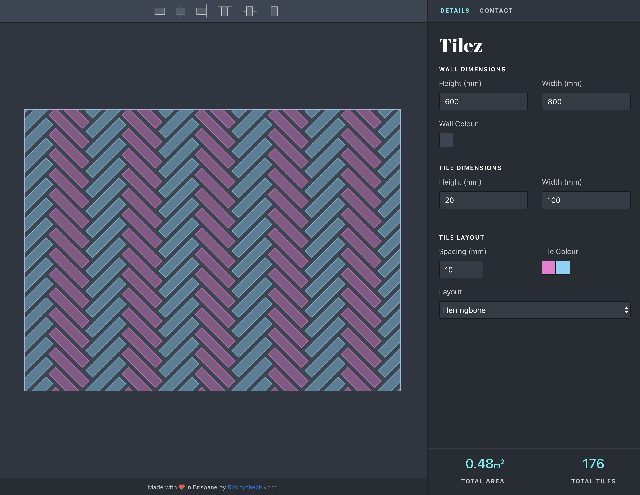
During a recent bathroom renovation we needed to work out the number of tiles required for a splashback in a herringbone pattern. The traditional way is to lay the pattern out and then determine the number of tiles and positioning from that.

Instead I wrote this simple tool that uses Fabric.js and some basic collision detection to work this out.

There are still a couple of features that I’d like to add including working out if I can reuse corners of tiles if only one corner is needed.

Work out how many tiles you need

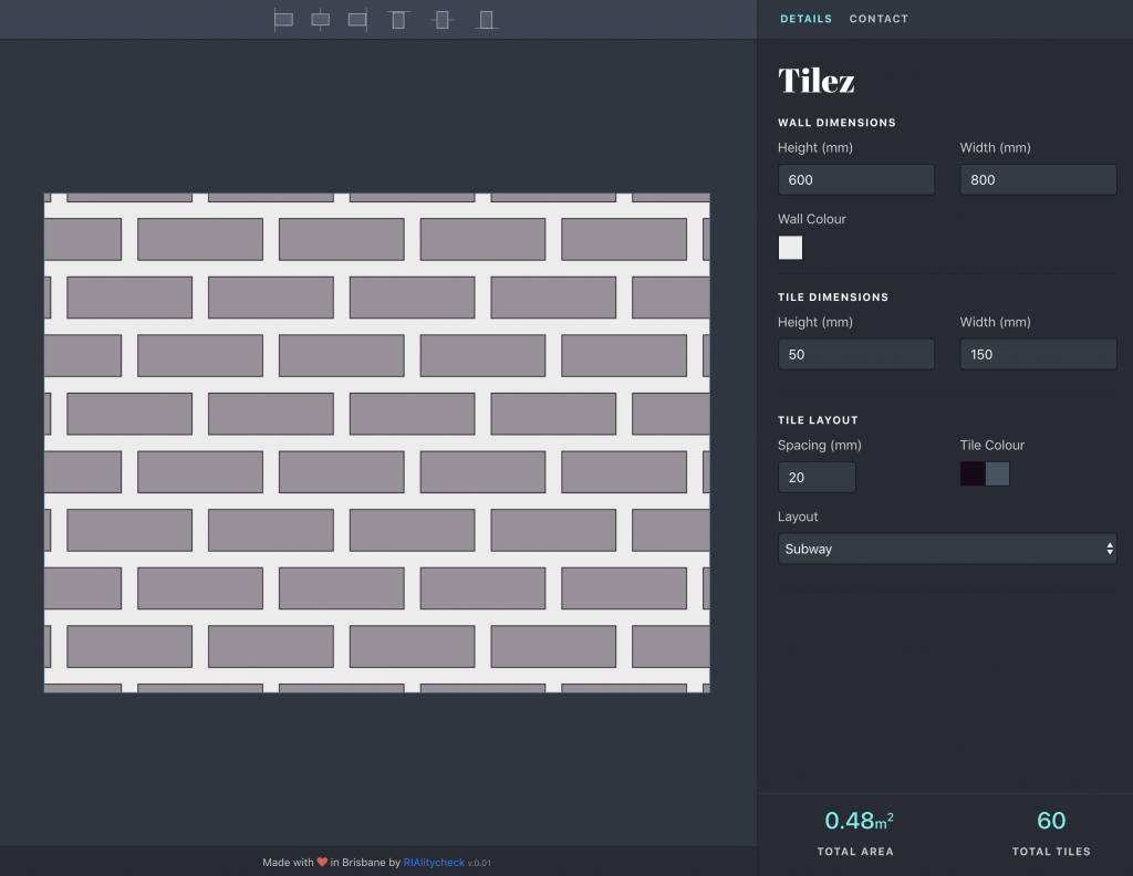
Subway Layout
Subway Layout

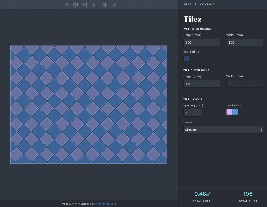
Checkered Layout
Checkered Layout

Expandable Text Area

I had an issue recently where there was a standard form item, with a textInput as the entry component. The problem was that a single line was not large enough for the client to enter in the details that they required. Using a text area would be my next logical choice however because of certain real estate restrictions I wanted to keep as many form elements visible on the screen at the one time.

Hence the Expandable Text area, a hybrid of the single lined TextInput and the TextArea. Where typing and removing text would re-size the input component accordingly, and setting a text value would expand the component to cater to the text size.

It’s a fairly simple component with the overridden measure method doing most of the work.

measure

Below in the measure command we utilize both the viewMetrics to determine the number or lines and then the measuredHeight of the TextArea

onTextChange

There is also a listener and handler for the “textChanged” event that is dispatched from the extended TextArea. This handler invalidates the size of the component if the number of lines in the textField has been modified. I also had to sets the variable called useLineCount to determine whether the textFields.numLines attribute should be used. As when the component is first initialized with text, the textFields layout is not yet completely set thus returning an incorrect numLines value.

updateDisplayList

And the last piece is the updateDisplayList which sets the actual size of the textField based on the number of lines and the components unscaledWidth. It also sets the explicitWidth of the component if it results in a NaN. This occurs if the component’s width is determined by a percentage or layout constraints.

There it is, unfortunately it’s written with the Flex 3 SDK although I’ll eventually port it to 4. It’s a hybrid between the two text inputs which will enable the user to concentrate on data entry without having to worry about scroll bars and what they’d typed 50 characters ago.

Animating Spark List Items.

Previously in Flex 3 List Components came with a style property called the itemsChangeEffect. This allowed you to specify a sequence of effects to apply to the item renderers when a change to the dataProvider occurred.

eg.

Because I was writing a Flex 4 Application I couldn’t find anything similar to this property in the Spark List components, so I decided to roll my own utilising a Custom layout for the List Component.

With the Flex 3 itemsChangeEffect you had to wait for your data to change before the effect would take place. With my effect I wanted the user to be able to drag an item around the list with the other elements moving away to allow for placement of the dragged item. Kind of like moses parting the waves with a draggable item.
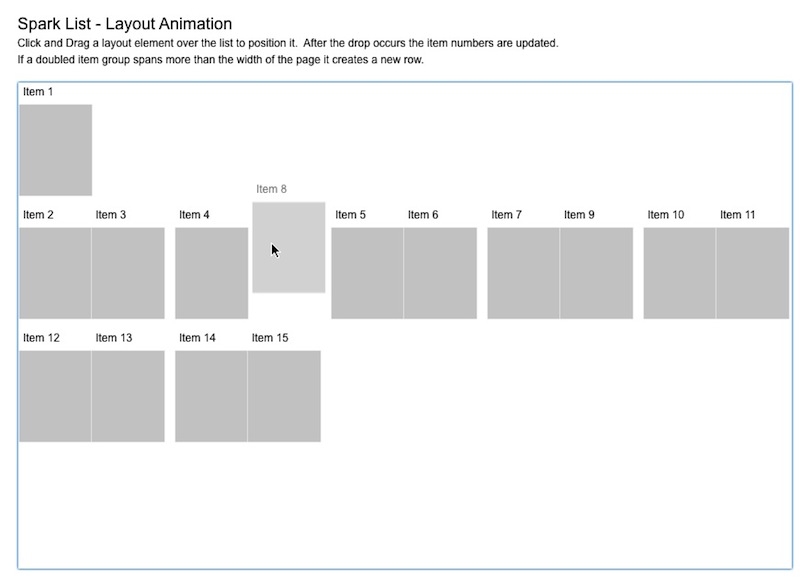
Writing the custom layout:

Positioning the Elements.

Inside the custom layout it’s the override of the updateDisplayList that does the hard yakka positioning and sizing the List items. It makes sure that the items x and y positions do not overlap or exceed the width of the component. In this instance the first item is in the first row and any subsequent elements are beneath this in pairs.

Drag and Drop

For this layout I still needed the the drag and drop functionality so I extended the TileLayout.
If you still need the drag and drop functionality you may need to override a handful of the methods needed to calculate the dropLocations,indices and the location of the dropIndicator.

calculateDropLocation
calculateDropIndex
calculateDropCellIndex
calculateDropIndicatorBounds

Animating the elements – things to remember

With animating a Flex container you need to set the autoLayout flag to false before the animation to prevent flex from updating the containers layout after a child element is resized or repositioned. Once the animation has finished the autoLayout flag can be set back to it’s default value of true.

Only animate the elements that need animating. This is fairly obvious but can become a real bottleneck especially when dealing with large datasets. Test an elements previous position to determine whether it needs to be included in the sequence.

Depending on your interactivity you may need to set useVirtualLayout to false. Because virtualisation uses an estimate of elements displayed on screen for positioning and sizing, I found that with scrolling and dragging elements beyond the containers current scroll index, these elements were not being resolved. By setting it to false all elements are created and positioned allowing any calculations needed by those not currently displayed on the UI to still be allowed.

You can view and example of the layout here.

You can read more about the Spark SkinnableDataContainers here

Here is a nice article on creating custom layouts with Spark here

Mashing up Flex in Australia

I recently found out about a competition being held in Australia, by the
Government 2.0 Taskforce called Mashup Australia. This taskforce, as taken from their Terms of reference.

will advise and assist the Government to:

  • make government information more accessible and usable — to establish a pro-disclosure culture around non-sensitive public sector information;
  • make government more consultative, participatory and transparent — to maximise the extent to which government utilises the views, knowledge and resources of the general community;
  • build a culture of online innovation within Government — to ensure that government is receptive to the possibilities created by new collaborative technologies and uses them to advance its ambition to continually improve the way it operates;
  • promote collaboration across agencies with respect to online and information initiatives — to ensure that efficiencies, innovations, knowledge and enthusiasm are shared on a platform of open standards;
  • identify and/or trial initiatives that may achieve or demonstrate how to accomplish the above objectives.

The Mashup Australia competition was created to emphasis this and provide a practical demonstration of the benefits of opening up sets of their data.

There was quite a large amount of data sets available albeit some not exactly in the most usable format. It was a great way to make the public aware that this data exists, and for us as developers to have fun with how this data could be presented.

I spent a few days on a couple of entries, using flex and flash for the UI. It would have been nice to have a bit more time to test them and to add a few more bells and whistles.

1.

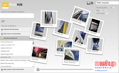
The first idea I had was called the GCI PhotoHUB. Because a number of Government Cultural Institutions publish their photographs onto flickr I thought it would be nice to have a central application to be able to search/view these common image sets.

I used the neat as2flickrlib API however I did realise that the commons API was not included in the lib so I had to write one myself for getting that particular piece of information.

I wanted to create something that was intuitive for the end user and something a little playful for them to interact with.

This is the entry here

2.
The second idea was to create more visually digestible way to display crime statistics in Australia. I chose a number of methods for this which included primarily a map overlay, secondary – charting components, thirdly – a raw data set. I felt that this would give the end user 3 options depending on what they felt comfortable with.

The initial UI was changed slightly after working through some UX concepts from a good friend of mine who works as a UX consultant.

There were a number of design cues including the map indicators taking reference from police lights as well as the font chosen for the map overlay to help with the overall theme.

The data set provided was in the form of an xls document. Because .xls documents aren’t exactly the best format for web applications. I created a webservice to read the xls file and serve up the data as both a ColdFusion query set as well as a call to return XML. Making the data much more useful for both Flex and potentially other developers eventually.

This is the entry for crimewave here

Both these apps were built in quick time so I’m sure there will be a couple of bugs crawling around 🙂 so if you find one feel free to let me know. Overall it was a fun way to utilise this newly exposed data from the Government and even a better way to expose it using Flex as the tool.

Who should know about RIAs

During the times when I’m attending an event that is non-IT related people ask me what I do for a living. Most often then not when I tell them that I build RIAs for companies they tend to get a glazed look over their face. It’s similar to the look of an original flavoured Krispy Kreme glazed donut, and where the eyes loose focus and start filtering out to the background. Worst case scenario is when I need to snap my fingers three time and tell them to return back to the conversation.

Most of the time I can prevent the “Krispy Kreme Look” by explaining to them the concept behind the RIA or Rich Internet Application. Once I do that the penny normally drops and they can name a couple of examples, most commonly TweetDeck and Twirl. These are two of the most downloaded Flex and AIR applications, and have done well in exposing the RIA to the broader community.

I think it’s important for us in the RIA space to be pushing the concept and benefits of RIA to the general public. From acceptance breeds growth, and in the digital realm RIA acceptance still has a little way to go.

In Australia recent studies have shown the amount of money spent in the digital arena is ever increasing. When compared to annual profit, the amount of money spent in digital is still rather small, even though online customer growth is increasing. It’s this statistic which had me thinking about the acceptance of RIAs in companies and them willing to invest in technology to help with their revenue stream. As the more a company spends in the digital environment the higher the margin of profit, it makes sense to invest in RIAs.

As customers migrate towards and expect more from companies in terms of digital services and experience. A companies customer service is no longer not only judged by the smile of the shop assistant or the friendliness of the wait staff but also by it’s online service. This is where well planned and executed RIAs excel, engaging the user, holding their hand through a complex task, giving them the information when they want it without hassle. The RIA doesn’t call in sick, steal money from the till or wake up on the wrong side of the bed, things that we have to deal with day to day with traditional customer service.

The technology is not important but the idea behind it is and it’s something that us working in the RIA world need to push, not only towards business managers but to the general public, the end user or customer.

As they say the customer is always right and by raising their awareness to RIAs it can not only benefit everyone involved but also the overall growth of the digital space.

Catalyst could save you time

I’ve just come back from attending the Brisbane leg of the Australian Adobe User Group. It showcased the new features and overall direction for the development suite of products which included the new Flash Catalyst, Flash Builder, Flex 4, Cold Fusion 9 and Bolt.

I was really interested in Catalyst as it’s something that I could see a lot of benefit in using personally.

Adobe has made a conscious effort to further improve the work flow between designer and developer which the introduction of Catalyst.

A tool to help create interactive user interfaces transitions and all, without having to worry about a single line of code. It also enables the user to port this directly into flex for the developer to turn this into an application.

By having something like Catalyst can remove the steps involved going back and forth between Interactive Designer and Developer as the explanation of transitions and state changes are nutted out in the design stage for the developer to see. Of course this is the ideal scenario and we all know it never exactly works out as smoothly as that.

For a designer it can eliminate the need to provide multiple screen shots of piece of interaction and the need further explain your concepts through emails, phone calls, power point presentations, smoke signals or interpretive dance.

It’s still in Beta so I’m sure there will be many more tantalizing features to come but so far it’s looking great.

Overall I can come away from the user group meeting knowing that Adobe is indeed heading in the right direction. They have identified the need to streamline the design/development work flow, as well as further enhancing an existing suite of core products.

Having said that I still think a developer that can touch type could save you more time 🙂

You can download the beta version of Catalyst from the Adobe Labs here

I think I might try a Swiz

After talking to a friend about frameworks and so forth. He mentioned
the Swiz framework after incorporating it in a project he was currently working on. Being a dedicated Cairngorm guy I couldn’t say
that I had looked at Swiz before but from what I had heard it sounded like something that may be useful in the future. I had also thought it would make a great name for a cocktail “Excuse me bartender fetch me another Swiz”…

What’s your pot of gold at the end RIANBOW

This is my first post for 09 and coming of the back of the new year which goes hand in hand with resolutions and all that jazz.

What is your motivation in being a RIA developer?

For me it’s seeing a project evolve from it’s conceptual stages through to it being released to the end user. I get my thrills out of knowing that people are actually using this application that had started out as a twinkle in a project team members eye. It’s even better when they are absolutely over the moon with the end result.

I know many others who find utter enjoyment in coming up with the perfect class, function, or design pattern.

So what’s your motivation, what’s your pot of gold?

Finding UI inspiration in the everyday.

Finding inspiration in the everyday.

Often when I’m working on a certain aspect of the UI design phase for while I sometimes find analogies in everyday occurrences that I can relate back to the current UI I’m working on. It doesn’t matter if it’s a good or bad experience it’s all part of drawing information and ideas outside the context that you’re working in. I may look at it and work out how could this be improved or what makes this a good experience.

It’s true with everything though, the more interest you take in something the more you notice it, and the greater the detail you notice it with.